
Diseño de control táctil: menos (control) es más

El fallo más común en el diseño de controles táctiles: intentar incorporar demasiadas mecánicas concurrentes al mismo tiempo.
Si su juego es en tiempo real (juegos arcade, juegos de acción) que requiere que los jugadores tomen decisiones rápidas basadas en un reloj en tiempo real, tener demasiadas mecánicas de juego funcionando simultáneamente solo confundirá y frustrará al jugador. Por lo tanto, debes estar atento a cuántas mecánicas, como diseñador, le pides al jugador que realice un seguimiento al mismo tiempo.
Elija la prioridad principal en la que desea que se centre su usuario y elimine tantas otras mecánicas como pueda. Si se necesitan otras mecánicas, permita que el jugador cambie entre modos, para que pueda concentrarse en una mecánica a la vez.
Por lo general, al migrar un diseño de una plataforma anterior, existen fallas de diseño comunes que pueden simplificarse para reducir la cantidad de acciones simultáneas.
Un botón sin sentido
Si tu juego implica que el jugador mantenga presionado constantemente un botón o toque un botón sin pensar, entonces debes reconsiderar si esta mecánica es realmente necesaria para dispositivos móviles.
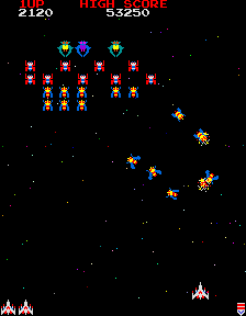
Galaga(c) — Crédito Namco
En un juego de disparos arcade estándar, el jugador es responsable de dos mecánicas: elegir cuándo disparar y evitar obstáculos. El jugador presiona constantemente el botón de disparo, mientras controla a su luchador con la palanca de control.
¿Cuál es la mecánica central en la que estás intentando centrarte? ¿Cuándo disparar o evitar obstáculos? Elija uno y elimine el otro a menos que esté dispuesto a sacrificar usuarios.
Si elegir cuándo disparar es la parte más importante, entonces elimine la evitación de obstáculos. El jugador resulta herido si un oponente llega al final de la pantalla.
Si lo más importante es evitar obstáculos, entonces elimine elegir cuándo disparar. La nave se dispara automáticamente y el jugador se equilibra entre atacar a los enemigos y evitar obstáculos.
Los botones sin sentido aparecen en muchos diseños de arcade tradicionales. Tocar rápidamente la pantalla puede ser un buen diseño: esta es una excelente manera de cambiar el ritmo y aumentar la intensidad del juego. Pero si cambia a un grifo lo más rápido que pueda, considere eliminar todas las demás mecánicas durante este tiempo.
Estudio de caso: Drag Racer
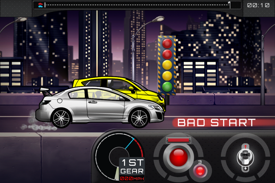
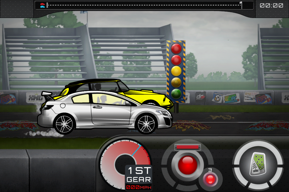
¿Por qué el botón de aceleración mientras corres? Los jugadores no necesitan controlar su velocidad, ¡solo necesitan avanzar!
Drag Racer fue un juego que diseñé en 2001. Fue un juego flash muy popular entre 2004 y 2008 en todos los principales sitios flash. Implicaba mejorar tu coche de carreras y competir por el mejor tiempo.
El juego consiste en mejorar y personalizar tu coche y luego competir contra corredores de carreras cada vez más desafiantes. El modo de carrera consiste en que el jugador presiona el acelerador al principio, logra el mejor comienzo posible y luego cambia de marcha en la posición más óptima. Es un juego de sincronización.
The core mechanic is timing your gas and gear shifts. But why does the user have to hold down the gas pedal? That’s just a mindless button.
In Drag Racer World, we moved the gas pedal and gear shifter to the same side of the screen. This removed the need for players to just mindlessly hold down the gas button, wasting a finger and forcing two handed control.
In the latest installment of Drag Racer, Drag Racer World (2012), the player first taps on the gas, then taps on each gear shift. The player can leave their finger on the gas pedal if they wish, but play can be accomplished with just 1 finger, allowing more casual play of the game.
Too much control
Usually porting a game from another platform can create issues of “too much control”. Other platforms have more buttons, more controls, and the audience is prepared to use them. On mobile there is no way to accomplish this control without adding more buttons or controls.
This platform is mobile. The phone is jostling around, the player doesn’t have an accurate mouse to track and click exactly where they need to be. On screen buttons have no tactile feedback so if the user moves off of your hit area, they aren’t going to notice until time passes by and they lose the game because they didn’t realize fast enough. I don’t think anyone wants to play a game that the best users are the ones that can stay on a on-screen button the longest.
Ask yourself whether this much control over the game is really required for the game mechanic.
Case Study : Designing for a Puzzle Arcade game
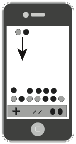
Arcade Puzzle games suffer from too much control. Imagine trying to port a game like Tetris, Dr. Mario, Puzzle Fighter or any of the games which require the player to control a falling puzzle piece and place exactly where they intended in the game world.
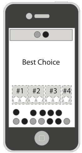
A Puzzle Arcade game : Slide or on-screen buttons to control the falling pieces?
These are notoriously hard to control on the touch screen device.
How do you control a falling piece? How do you rotate it?
Gestures? slide your finger left or right? That’s alright, but doing the left swipe over and over again is hard on the player.
Buttons? the player can lose track of them fairly quickly.
Do we really need to control the piece as it falls? Is that really the most important mechanic?
The most important mechanic is choosing where to place your piece in the limited time it has to fall. That’s the core of the game, and that’s the mechanic we should be using.
Tetris(tm) by EA Mobile uses tap to choose the location. Hardcore fans won’t have the flexibility of directing the pieces, but the mechanic simplifies the controls so that the player is focused on placing the pieces. Instead of dealing with the control mechanic.
You can instead design your game about deciding on where to place your piece in a limited amount of time. The game can guess all the best places to place the piece, and allow the user to choose where to place with just a simple tap.
Now immediately the player is not restricted by their ability to control on screen buttons. They can make moves quickly and without fighting against the controls. The player that wins is the one that can make the best split-second decisions, which is what the game design intended. In the end I consider this a great design decision by the team. However, the core audience most likely was turned off this because of the departure from the traditional mechanic — but if you’re serious about making a design work on mobile, you’re going tohave to break some rules.
One at a time…
Too many mechanics at the same time will confuse players and frustrate them.
But sometimes multiple mechanics are necessary for depth in the game play. When this happens it’s always best to prototype and user test simplifications of this. Try to keep this down to one type of touch mechanic at a time. Don’t mix Tap and Hold mechanics with Line Drawing mechanics unless you really give the user a chance to change their thinking.
Allow advanced users to opt-in to multiple mechanics at the same time. But don’t force it on them. This is a great way for users to expand as they become better at the game. Add this feature in when Players are so used to controlling your game with the one mechanic they can easily adopt the second mechanic.
If your primary mechanic is intense, time based and twitchy, your user will most likely have no time for a secondary mechanic. But, if your primary touch mechanic is strategic and intermittent, then your advanced players can control this mechanic in their peripheral. This allows you to add depth in adding in another mechanic.
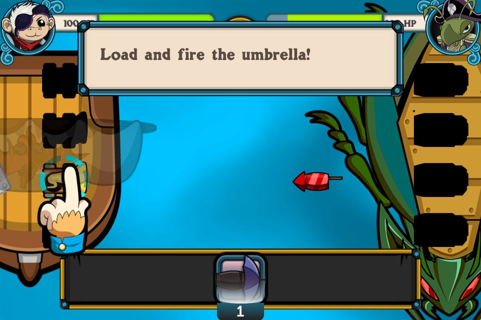
Powder Monkeys (2011 XMG Studio) Players primary mechanic is choosing which cannon to load the bullets. The Secondary mechanic is changing which type of bullet. This is only possible if the primary mechanic is strategic and intermittent. With Powder Monkeys when you are jumping between firing and choosing it can get really overwhelming. If the battles were paced a bit slower, we might have been able to fix this, but with the speeds of the battles we wanted, jumping between choosing cannons and choosing weapons felt overwhelming.
As always, user test your system to make sure it works and that users don’t feel overwhelmed managing the multiple systems.
Case Study : Cows vs Aliens Powerups
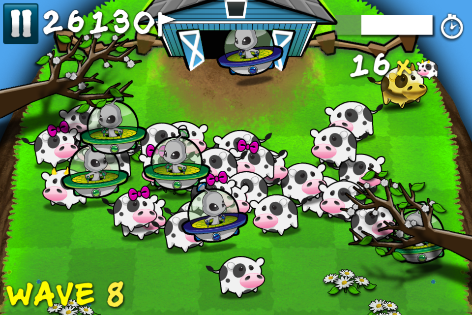
The original had players pausing the game to select their powerups.
Cows vs Aliens has three concurrent game mechanics : Herd your cows, kill the aliens, and use your powerups.
The first two mechanics are complementary and require only the core game mechanic to control: touching your finger down and influencing where you want the cows/aliens to go: the barn, or the cliff.
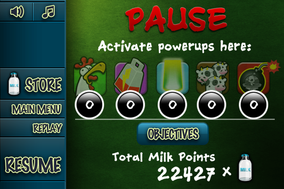
Se agregaron potenciadores después de la primera iteración del juego. Pero ¿cómo se incorpora esto sin confundir al usuario?

Agregar un botón para activar potenciadores. ¡¡Demasiados controles a la vez!!
Nuestro primer intento fue permitir que el jugador los activara en la pantalla. El jugador puede hacer clic en un botón HUD para activar un encendido. Este método saturó la interfaz, hizo que el juego pareciera más complicado de lo que pretendíamos y descubrimos que los jugadores accidentalmente hacían clic en los potenciadores cuando sus dedos volaban por la pantalla.
Estos son potenciadores por los que el jugador podría haber pagado dinero real, por lo que esto no era aceptable.
Nuestro segundo intento fue poner los potenciadores en el menú de pausa. Esto finalmente se lanzó porque no pudimos pensar en una solución mejor. Este método funcionó. Los jugadores fueron sacados del juego, eligieron estratégicamente su potenciador y eso los envió de regreso al juego. No más clics accidentales. Pero esto no fue óptimo. Parte del uso de potenciadores es poder usarlos “en la refriega”, justo en el momento en que más lo necesitan. Sacarlos del juego no es bueno para eso. El resultado final fue que muchos usuarios no podían encontrar los potenciadores, estaban ocultos en el menú de pausa que no gritaba "los potenciadores están aquí" cuando el jugador más los necesitaba.
Nuestro último intento fue tener un menú arrastrable para seleccionar potenciadores. El jugador puede mantener presionada la esquina superior derecha de la pantalla. Esto abriría un menú que mostraría cada uno de los potenciadores como una opción independiente. Luego, el jugador arrastraría el dedo hasta su selección. Esto no es tan intuitivo, solo lo han hecho algunas aplicaciones en la AppStore, pero permite una mayor flexibilidad y menos clics accidentales. También los mantiene en el juego.
Lo más importante es que cuando el jugador mantiene presionado el botón de potenciadores, desdibujamos y ralentizamos ligeramente el juego, dándole al jugador un poco más de tiempo, un respiro para elegir qué potenciador quiere usar estratégicamente. Descubrimos que esto funciona mucho mejor y mantiene alta la intensidad del juego.
Pero observe cómo solucionamos el problema de la “tercera mecánica”: encontramos una manera de que el jugador se concentre en uno a la vez. Cuando el jugador elige qué potenciador quiere, el juego se ralentiza y se desenfoca. Tener los 3 a la vez es demasiado caótico. Esta mecánica no era complementaria a la mecánica principal, por lo que tuvimos que cambiar al jugador de un "modo" a otro para permitirle utilizar la mecánica sin confundirse ni frustrarse.
Trate siempre de tener 1 mecánico a la vez. Es posible tener más de un mecánico, simplemente permita que el usuario se inscriba. Luego, asegúrese de que el jugador tenga tiempo para reconocer el cambio de contexto (ralentizar el tiempo, aliviar la dificultad) o de lo contrario se sentirá confundido y frustrado.
Leave a Reply